
It is time to make a decision. I have to submit my photos to the Iowa State Fair photography Salon on June 27th. I have eight pictures I'm considering but I can only submit four and I need enough time to have them properly mounted and matted by professionals. I have ordered all eight printed to 8x12 size on fancy paper with fancy finish so that when I decide I can go right to the store with the four final selections.
My dilemma is that I cannot decide on which four photos to choose. Photography is incredibly subjective. I am confused by some photos that others absolutely love. I find some photos beautiful and others find them just okay. I am my own worst critic and am too close to my photos to choose.
And now I need your help! Please comment and let me know which four photos you like the most. You don't have to say why or in what order you like them, just which four are your favorite (or the least bad!!). The picture number appears below each photo.
I can't thank you enough for helping me out!

State Fair Possibility # 1
Class: Theme Family Farm, Color

State Fair Possibility # 2
Class: Theme Family Farm, Black & White

State Fair Possibility # 3
Class: Plants & Flowers, Color

State Fair Possibility # 4
Class: Thinks & Still Life, Color

State Fair Possibility # 5
Class: Animals, Insects & Wildlife, Color

State Fair Possibility # 6
Class: Theme Family Farm, Color OR Class: Things & Still Life, Color

State Fair Possibility # 7
Class: Plants & Flowers, Color

State Fair Possibility # 8
Class: Plants & Flowers, Color



18 comments:
I can see why the choice is so difficult - they're all beautiful. My absolute favorites are numbers 4 and 5 (with 5 being my absolute favorite favorite! I want a print of that!). I think I like number 1 over number 2. After that, I can't decide! I like the texture in number 6, and I like the detail in number 8. Good luck!!
My favorites are 1, 4, 5 & 8. That said, I know nothing about photography! (So maybe you should submit the other four?)
i love your stuff and love ones that are posted in these too... but from these 8 - my pics would be...
#1 (the color is fabulous), #3, #4, and #8
My favorites are the tractor in color and the Christmas light with frost on it. Really beautiful!
I like 3, 4, 6, 7, and 8. 4 is my least favorite out of those, but I'd cut 7 or 8 since they are very similar. Probably 8, since I love the saturation in 7.
5 jumps out at me - I loved that one the first time I saw it! 8 is awesome too. I like the tractor in both color and bw. I tend to gravitate towards bw so if I had to choose between the 2 I'd say the bw one. They are all very nice :)
My absolute favourite is 4--that just looks so amazing with all the ice. I thought it might be a berry that managed to make it to winter instead of a Christmas light!
I like 5 because the goat looks so aware, like he's staring straight out of the picture.
8 because looks like a small sun bursting to life, not just a flower.
And 6 because I thought the crowbar was an animal reaching over for a second.
Such great photos to choose from!
I like the tractor in color (#1). The scene just looks to peaceful but the colors are so vibrant!
The Christmas light in the frost (#4) is stunning.
And who could resist that sheep's curly locks (#5)? But that might be my yarn addiction talking.
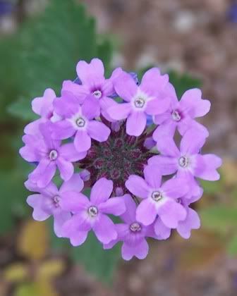
Both of the purple flowers are gorgeous, but I'm more drawn to #8 than #7. I'm really not sure why.
Best of luck with whichever ones you choose!
2,4,5,6 But I also like 8. I think B/W is the right choice for the tractor; it says more. And you know I absolutely love #4 (after all, it's one of my wallpaper choices!) The goat -- wow!
Oop. You know I meant sheep, don't you!!
#4 is simply amazing.
I like 3, 4, 5, and 6 best. It's hard to narrow them down. You do great work.
I vote for 1,3,5 and 8 if you're still taking votes. Very much like the tractor - it seems to capture the essence of the rural landscape. And going closeup on the flower is nice, a little different from the typical flower picture and also quite pretty. Very cool stuff overall!
OOh...hard choice. 1, 4, 5 & 8, I think, but I don't think you can go wrong!
Carla
I like 1, 4, 5, 8 or 7
Good luck SJ <3
My absolute favorites are nr 8 (which I find has a much more interesting composition than nr 7), nr 5 (love the fact that the nose and not the eyes are in focus composition wise), nr 6 (the simple motif is great and I love the colours) and nr 4 (exciting motif and he sharpness and play with colour is outstanding).
Want to know why I don't vote for the others? I find the tractor pictures to be bit commercialized. I might have liked them better if John Deere wasn't in the middle of the picture. The shade on the tractor also makes the brand name pop out in a way that I find disturbing. (But maybe John Deere works perfectly in Iowa?) Nr 3 has awesome colour but to me the focus and sharpness is in the wrong place. And even though I love the colours of nr 7 the composition comes out as unoriginal and boring compared to nr 8.
Good luck! I'm holding my thumbs!
1! 4! 5! 8! You actually didn't include some of my personal faves (crabapple blossoms) of yours, but they're all so great so it's hard to choose.
Put me down for 3, 4, 5 and 8, with 4 as my runaway favorite.
Of course, I have the aesthetic sense of a garden slug *and* a firmly-held belief that cameras hate me whether I stand in front of them or behind them, so you may want to toss this vote into the "hanging chads" pile...
Post a Comment